TRENDING PALETTES: 6 COLORS EXPECTED TO DOMINATE 2024
As we step into the vibrant canvas of 2024, major paint brands have cast their predictions on the hues that will define interior spaces for the year ahead. From blissful blues to moody elegance and serene neutrals, a spectrum of colors awaits those seeking a refreshing transformation – with many paint brands predicting blue is the hue for 2024. Stay up to date and explore the trending palettes that color experts believe will dominate interior design trends in 2024.
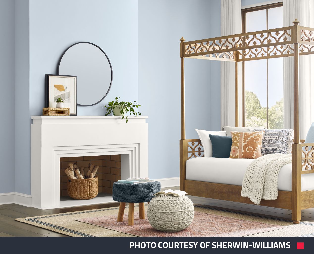
1. Upward by Sherwin-Williams
Looking for a shade that’s breezy and blissful? Upward SW 6239 by Sherwin-Williams is just the blue hue you need to add a little peace and tranquillity into a space. Take a breath and unwind, rest and reset, director of color marketing at Sherwin-Williams said, “It brings to life that carefree, sunny day energy that elicits a notion of contentment and peace”.
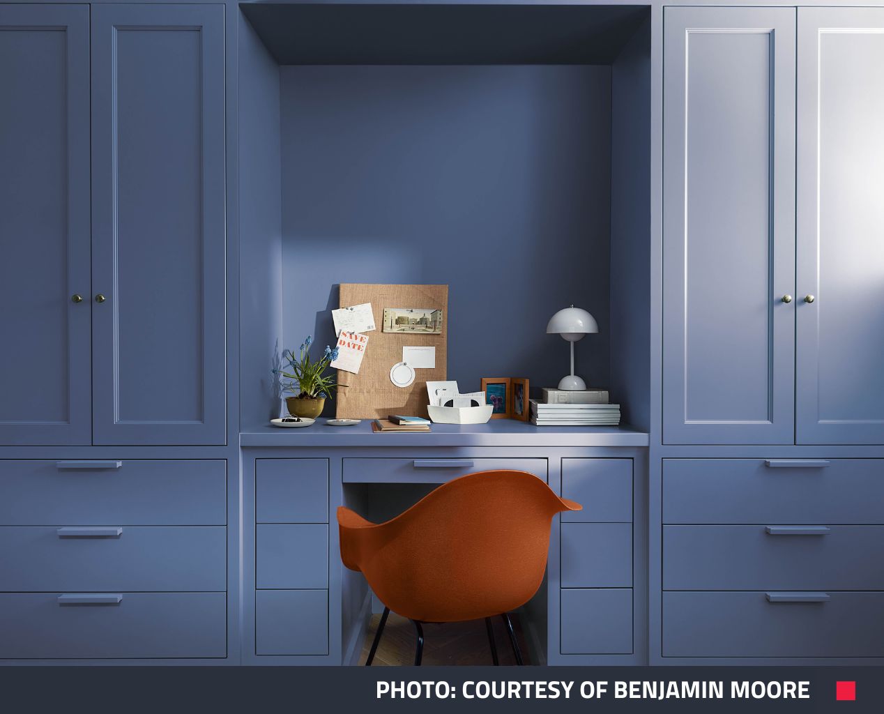
2. Blue Nova 825 by Benjamin Moore
Benjamin Moore’s captivating hue Blue Nova 825 is an enchanting fusion of blue and violet that sets out to ignite a sense of adventure while elevating surroundings and broadening horizons. Drawing inspiration from the glowing radiance of a newly formed star in space, Benjamin Moore’s Color Marketing and Development Director Andrea Magno said “Blue Nova 825 is an alluring mid-tone that balances depth and intrigue with classic appeal and reassurance”.
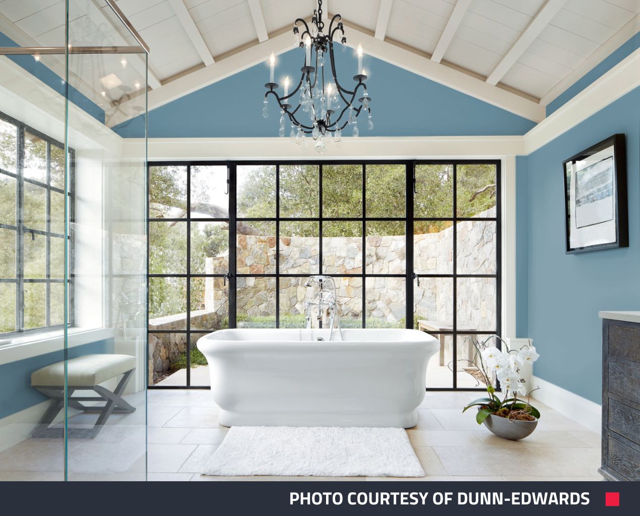
3. Skipping Stones by Dunn-Edwards
A blue hue with hints of grey and green, Dunn-Edwards invites you to experience the calming embrace of its color of the year, Skipping Stones. DeMing Carpenter, color expert at Dunn-Edwards, describes the versatile neutral blue as “a daydream” that adds “mystery and thoughtfulness to any space”.
“It’s part of the resurgence of blue and represents a shift away from the bold, warm-toned colors we’ve seen gain popularity over the past few years. This blue is timeless and versatile, fresh, and serene,” she said.
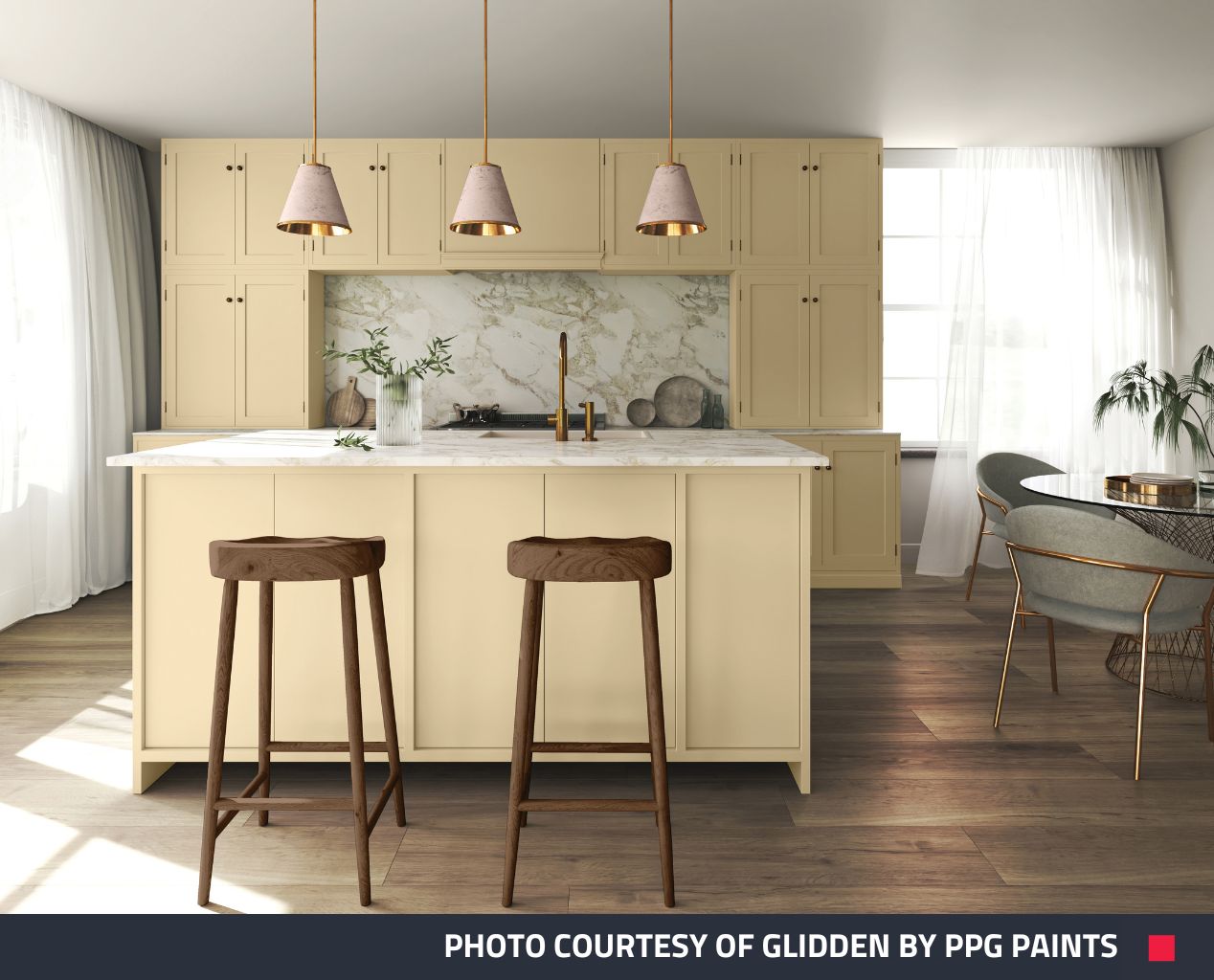
4. Limitless by Glidden
Embrace warmth, neutrality, and limitless possibilities with Glidden by PPG Paint’s color of the year - Limitless. This shade seamlessly balances the punchy power of color with "the essence of a neutral to support both cool and warm tones". Ashley McCollum, PPG's color expert for Glidden, sees Limitless as a response to “a new era of explosive creativity and change”.
“Consumers are using color in even more unconventional ways than ever before and they need a palette that offers versatility to work with both new and existing decor,” she said.
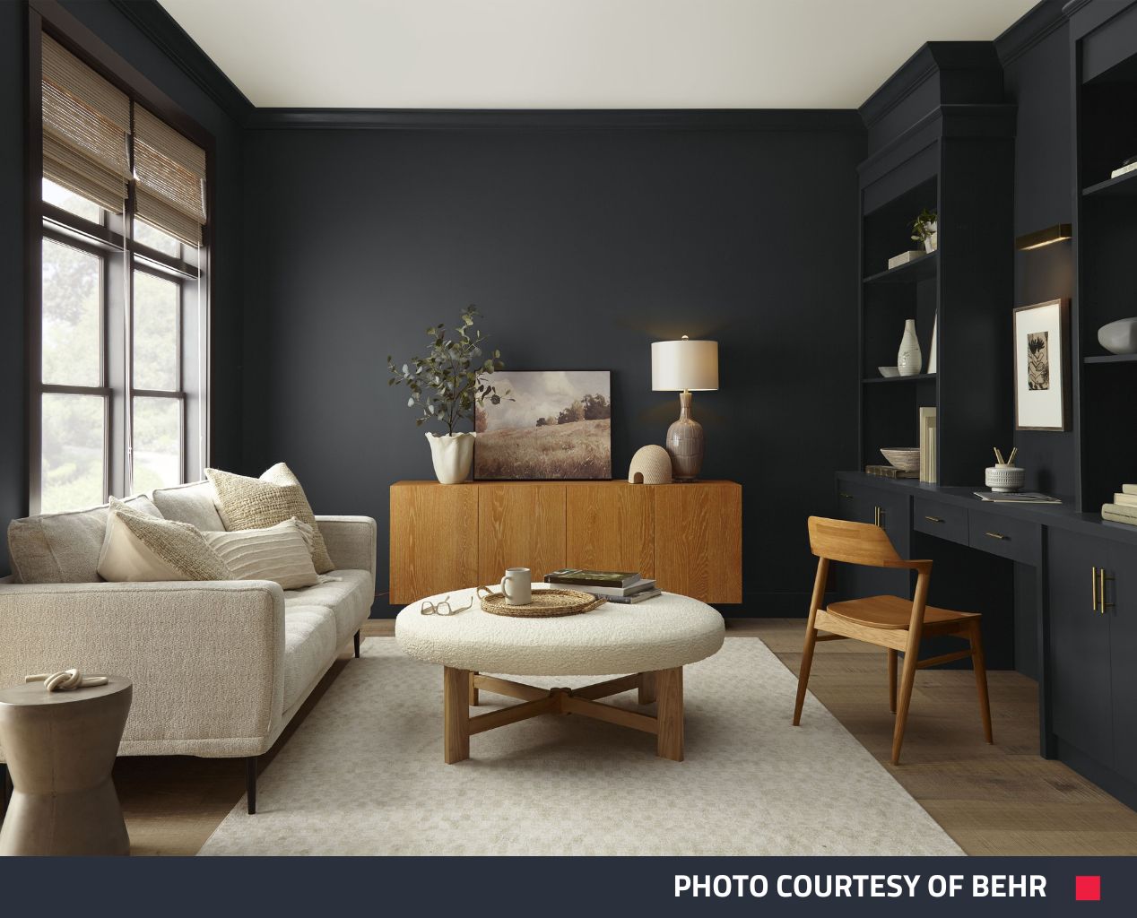
5. Cracked Pepper by Behr
Make a statement and add a touch of sophistication to any space with the soft versatility of Behr’s color of the year. Cracked Pepper PPU18-01 is the neutral you didn’t know you needed, it can effortlessly harmonize a room, pairing simply or accentuating boldly with a diverse range of design styles.
According to recent research by Behr Paint, 57% of Americans believe that darker wall colors provide a designer aesthetic, and 54% find that black tones create a new energy and vibe within the home. As Erika Woelfel, Vice President of Color and Creative Services at Behr Paint Company, notes, Cracked Pepper has the unique ability to enliven the senses.
“From heightening the aromas of a dining room to feeling the softness of a living area, Cracked Pepper enhances the natural expression in any space,” she said.
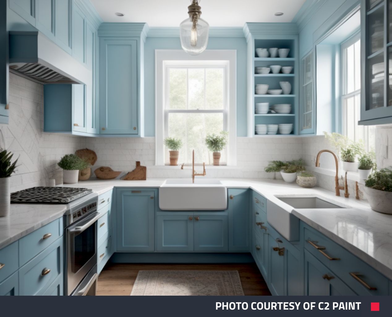
6. Thermal by C2 Paint
Searching for a hue that goes beyond adorning your walls to rejuvenate your spirit? Enter C2 Paint’s Thermal #752, a fluid, refreshing blue that transcends the ordinary, striking a harmonious balance between invigoration and calm. According to Philippa Radon, Interior Designer, and C2 Paint Color Specialist, "C2 Thermal reminds us of a vast blue sky and the infinite array of blue hues nature offers to help restore and redefine our mood."
“This bespoke pale yet punchy blue is poised for adventure and brimming with hope, evoking feelings of loyalty, trust, and confidence,” she said.
“Its contradictory nature has the dual ability to uplift us and provide a sense of calm and tranquility."
Want a Color Change?
Do you have a property with a dated color palette, a color scheme that may not appeal to many or just tired paint on the walls? You can revitalize your listing to increase appeal with our Color Change add-on edit!
Update and elevate the look of your space by showcasing its potential with the latest color palette of 2024. Our Color Change edit option is a powerful tool to reimagine a space and highlight its unique features, creating a visual narrative that resonates with clients.
Get a Color Change with these Edits
Submit an Image Enhancement job and add a Color Change edit to change the color (not texture or material) of any item including walls, ceilings, furniture, or garage doors.
Submit a Virtual Renovation job and add a Color Change edit to change the color only (not texture or material) of existing walls, ceilings, or doors.
New to BoxBrownie.com? Sign up now to receive 3 Image Enhancement edits, 1 Day to Dusk edit, and 10 AI-written listing descriptions, all for free! No credit card is required.