PHOTOSHOOT ANALYSIS ON $380 PER WEEK RENTAL
Introduction
In today’s blog we are analyzing a photoshoot on Australian aggregator, realestate.com.au. This property is advertised as a rental for $380 per week. So, let’s jump straight in.
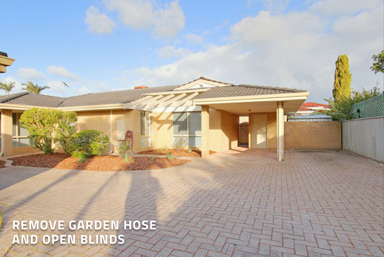
Firstly, we are looking at the initial image displayed on the listing. We notice straight away the neighbor’s roofline is displayed in the corner. It is best practice if these distractions can be avoided when shooting a property. You will also notice a garden hose visible. As this is a property management shoot, it is not a huge factor, however, it is always great to remove these items prior. One thing that we mention in a lot of our blogs is the importance of opening the blinds when shooting rooms. In this image, all the blinds are closed, whereas if the blinds were open it would create a more welcome feeling. The shadow of the photographer is also present in this shot. This is overall a great shot, however, with the additions we have suggested it could have been an even better image.
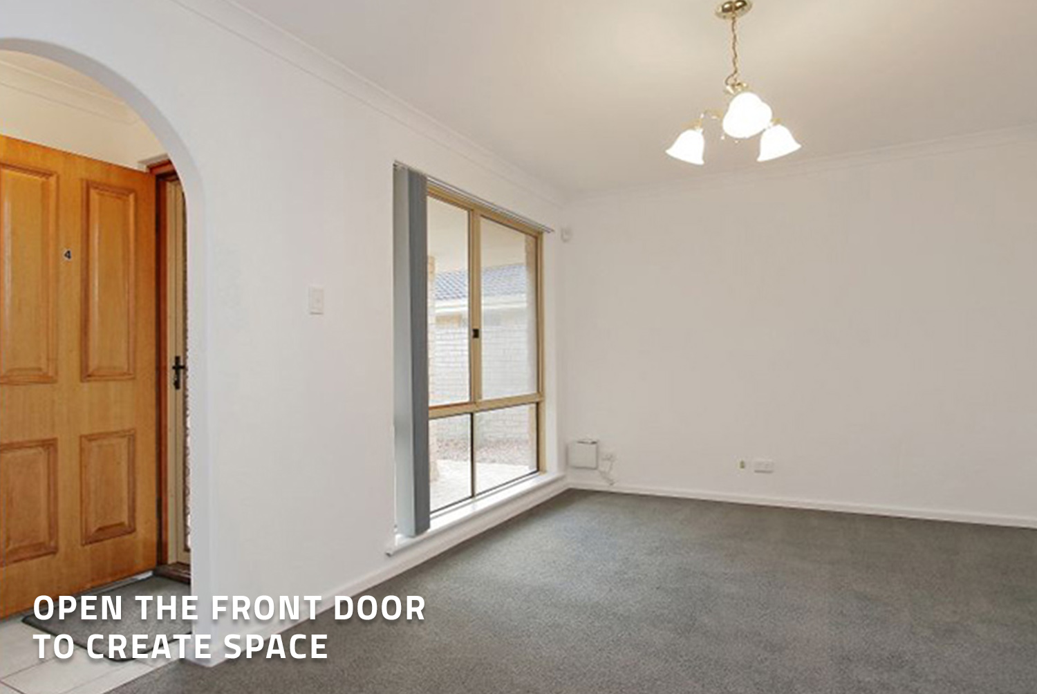
This is our first shot inside the property. Having the front door open is great for setting the mood and creating space in the entryway. Generally, we always suggest closing the blinds, however, this can be dependent on each room. This window is currently displaying the view of the neighbors so we would suggest pulling the blinds all the away across and opening them partially. You will then close the view of the neighbors but also bring in light to the room at the same time.
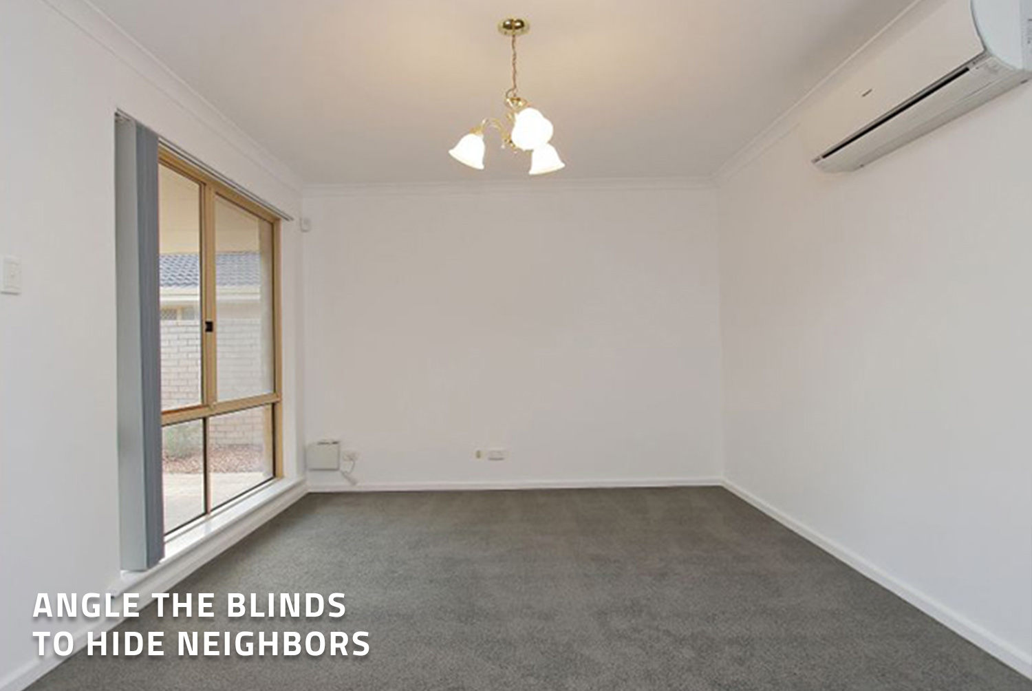
This next image is still the same room, just shot from a different angle. The same rule still applies with the blinds again, as you want to bring that attention back to the room. A great aspect of this room is the display of the air conditioning unit. This shows potential tenants what is included in the home.
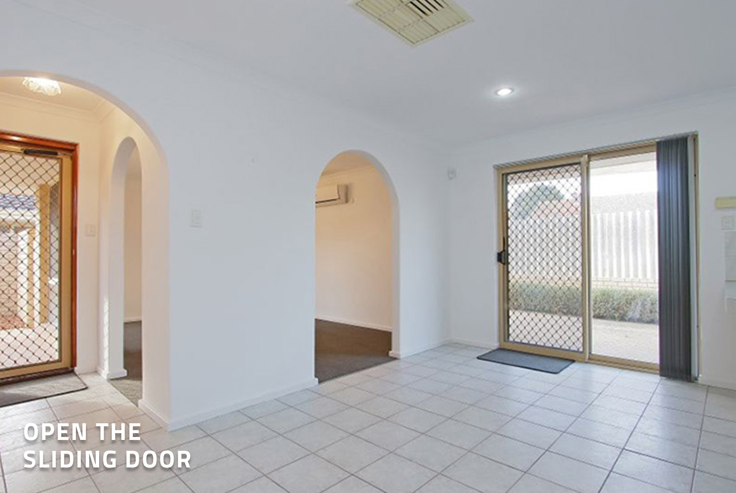
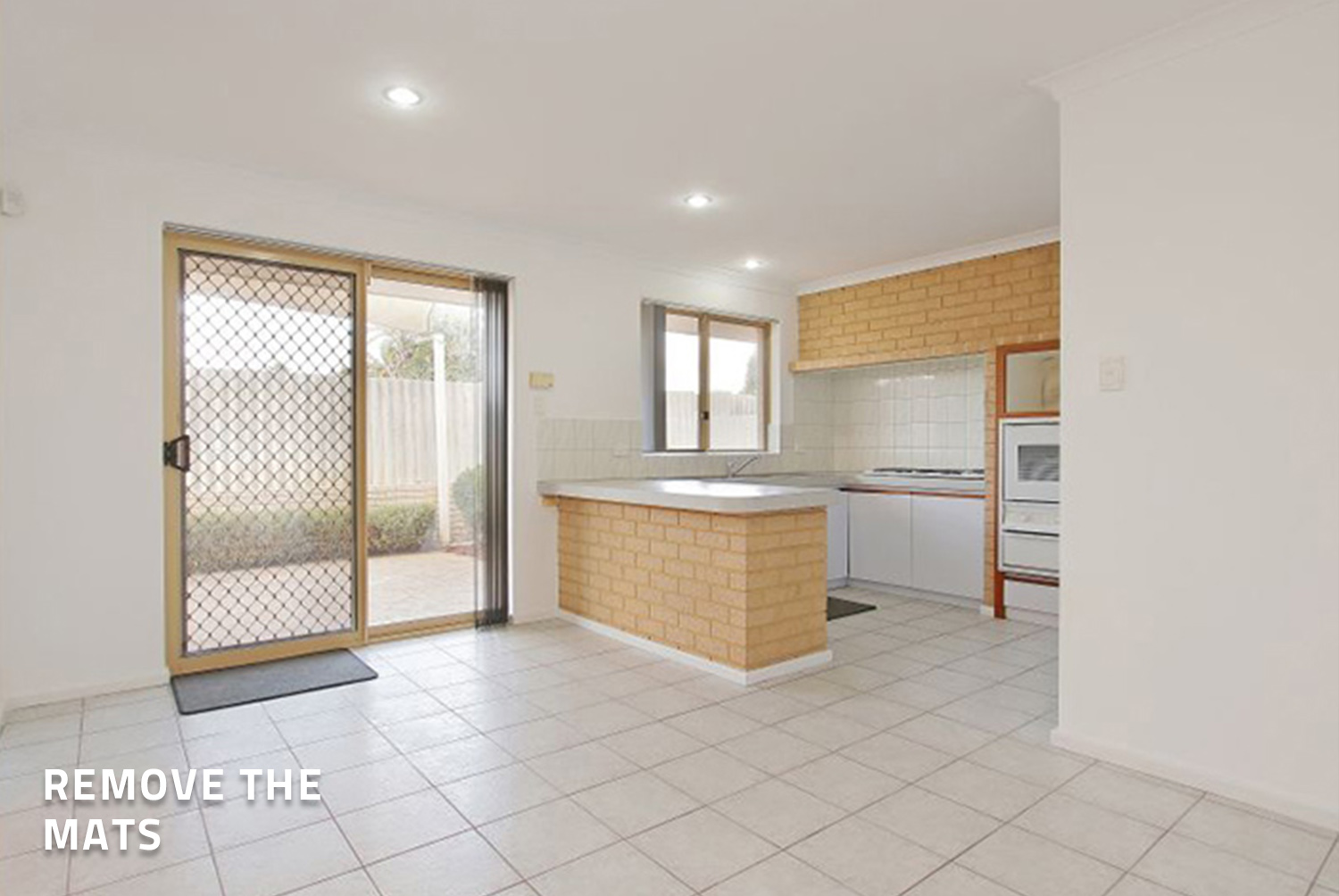
This image would have looked better with the floor mat removed and sliding door opened. In this scenario, it is perfectly fine to leave the blinds open even though you can see the neighbors, you are creating space. Speaking of creating space, it is great the front door has been left open to create flow and give a great understanding of the entry points. Everything still looks good and open, but it could still be better.
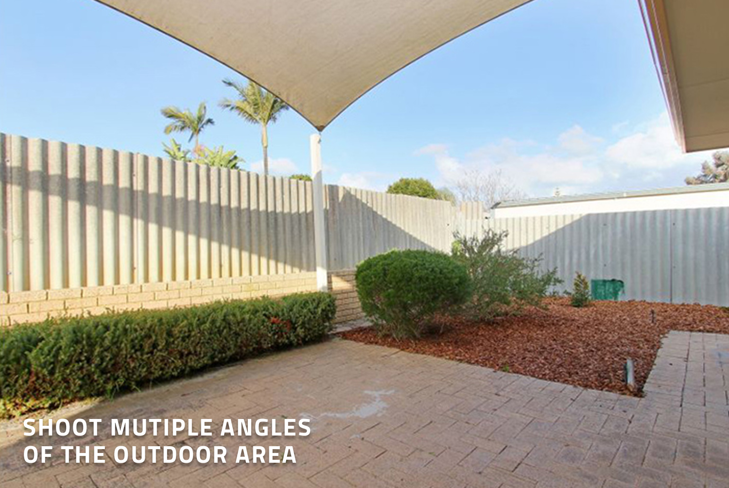
This is the kitchen and dining area. Once again, the door would be better open and removing of those mats both by the door and in the kitchen. The rest of the room looks quite good, however, if the door was open, keep the kitchen blinds to match with the blinds open in the dining area. This will keep the image looking nice and generic. The angle of the image could have also moved slightly to the left to add in some of the left wall which would frame the image better. We always suggest taking multiple angles whilst on site, so you can choose the best shot afterwards.
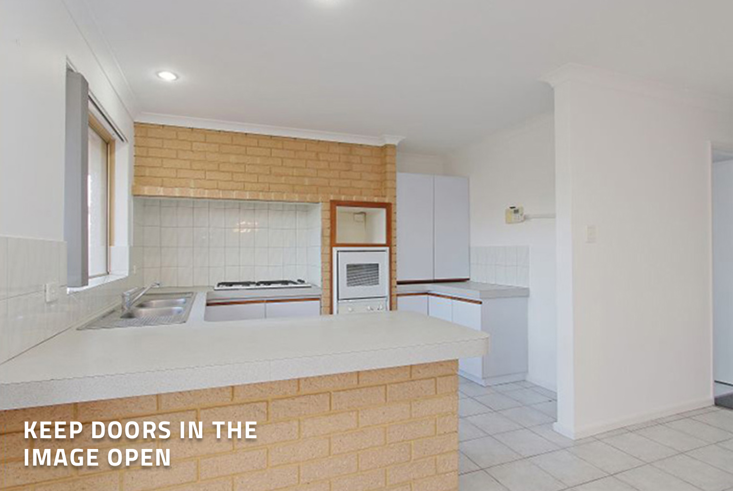
Here is another version of a kitchen. It is great the mat in the kitchen shown in previous images is now hidden and the doorway to the right-hand side is open. It is important to ensure the features of the kitchen are visible like the sink, stovetop, oven and plenty of cupboard space which are nicely displayed in this shot.
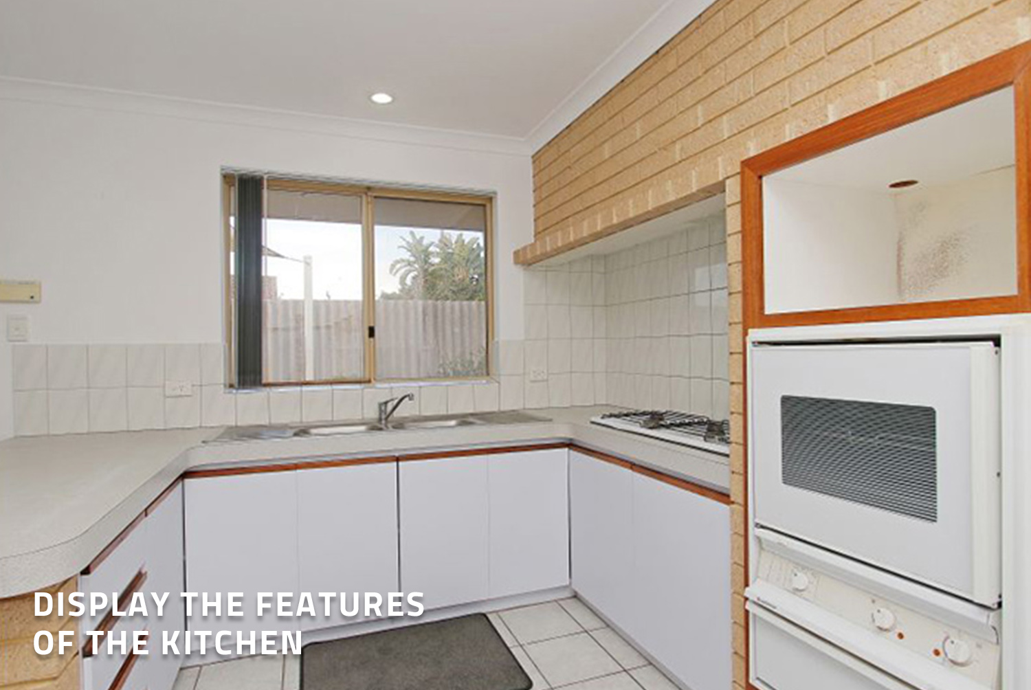
Again, this is another shot of the kitchen that is taken from a different angle. As this is a close-up image, you could have pulled the blinds across and left them partially open. However, as they would have been open in previous shots, it is okay to leave them to make it generic. At a minimum, we would have suggested to remove that mat on the floor. There is not much else the photographer could do in this room as they have done a great job with what they have had to work with. At BoxBrownie.com we can easily replace the outdoor sky in the image using our image enhancement edit.
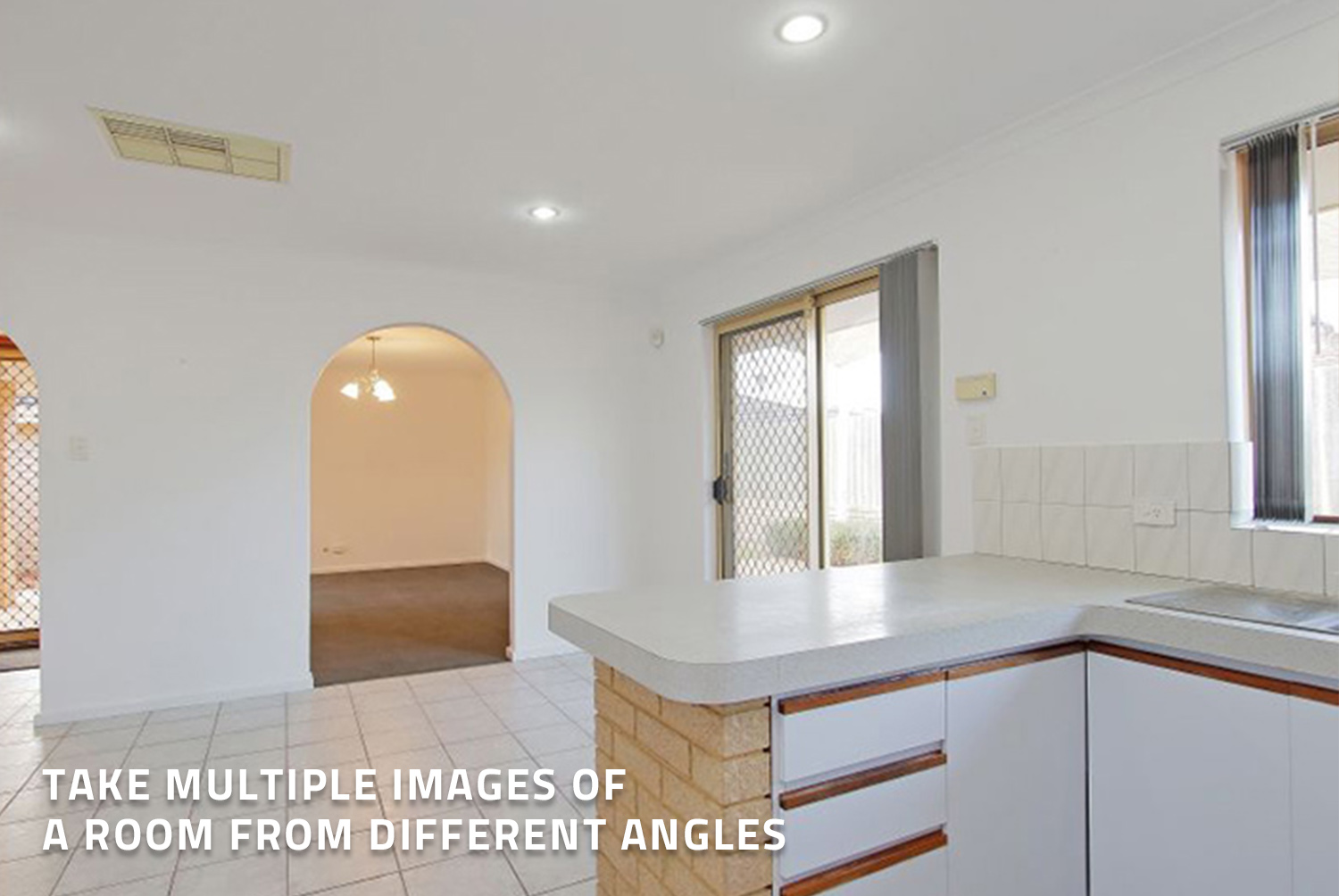
This is another version of the kitchen with the focus on the angle facing the dining and living area. Again, the sliding door needs to be open, however, there is not much else we can do here.
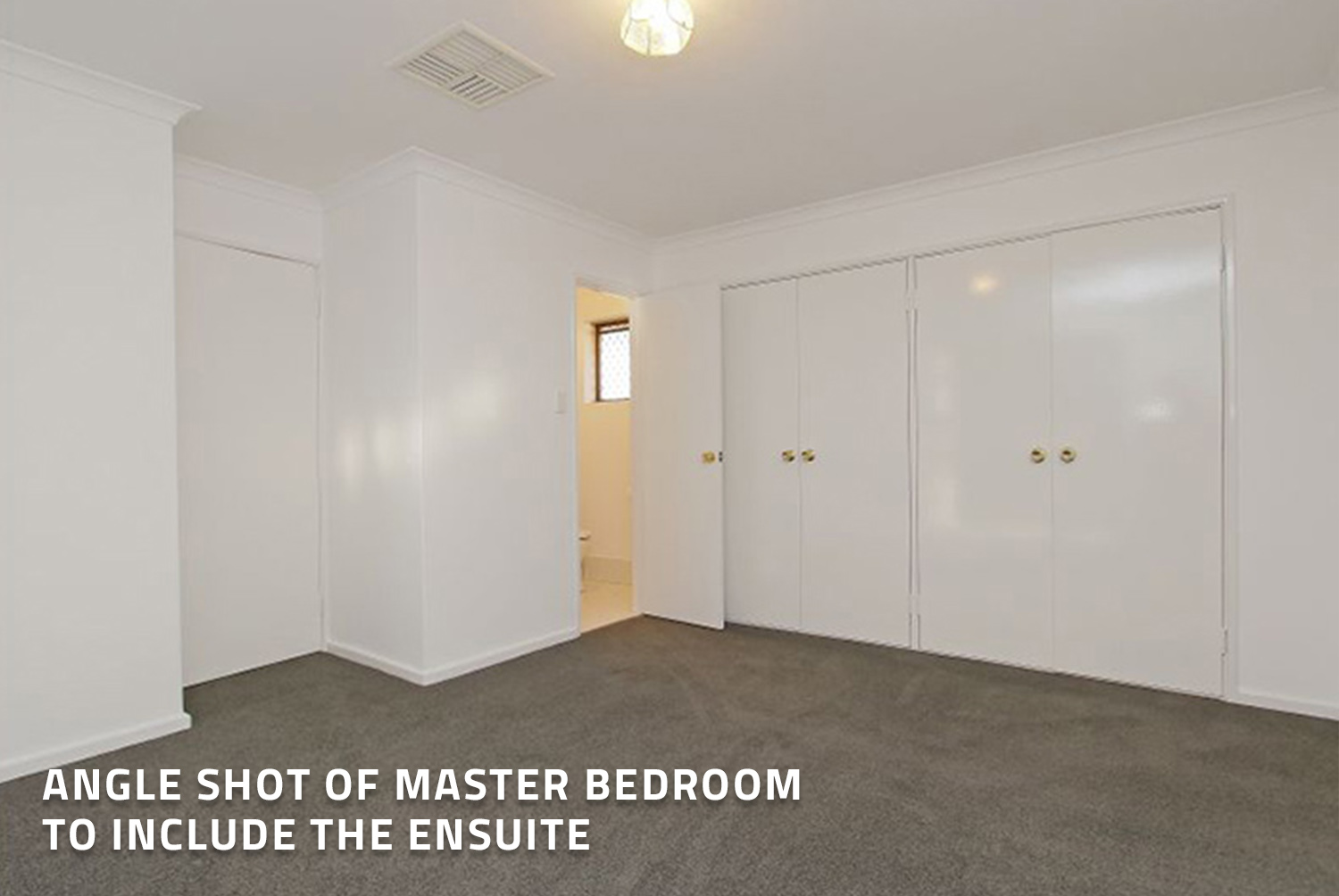
This is quite possibly the master bedroom. The blinds have been pulled across which is great, however, there are not quite angled correctly to block the outside view. As you keep going through the different tips below, you will see below a great example of how to achieve this.
This is a bedroom taken from another angle. It could potentially be linked to the previously image, however, it is not clear. Having the door open is great to clearly show potential tenants that it is a bathroom, along with the doors being closed to the wardrobe – always a must. Our only suggestion for this image would be for the door to be open to the bedroom to show what is behind it as we currently cannot see it.
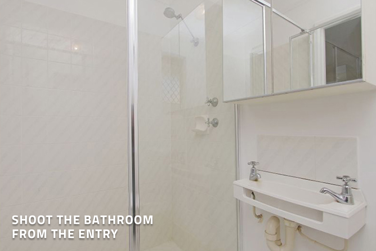
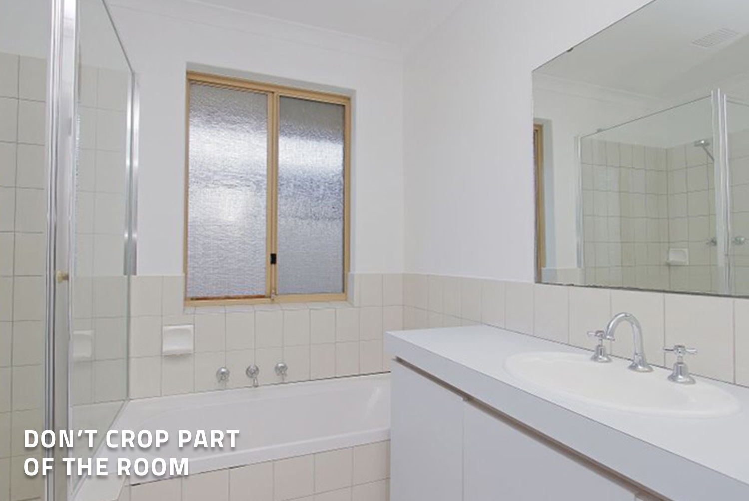
This one is an easy one to decipher. This bathroom shot has been cropped and shot too far in the room. This image would be better if it had of been shot a little wider and at eye level as it currently at the same level as the tapware. This is not what the potential client would see first when first walking into the room. We would have also tried to include to include a little bit of the door to make it a much nicer shot.
TIP: If it is a sliding door, we always suggest keeping it closed.
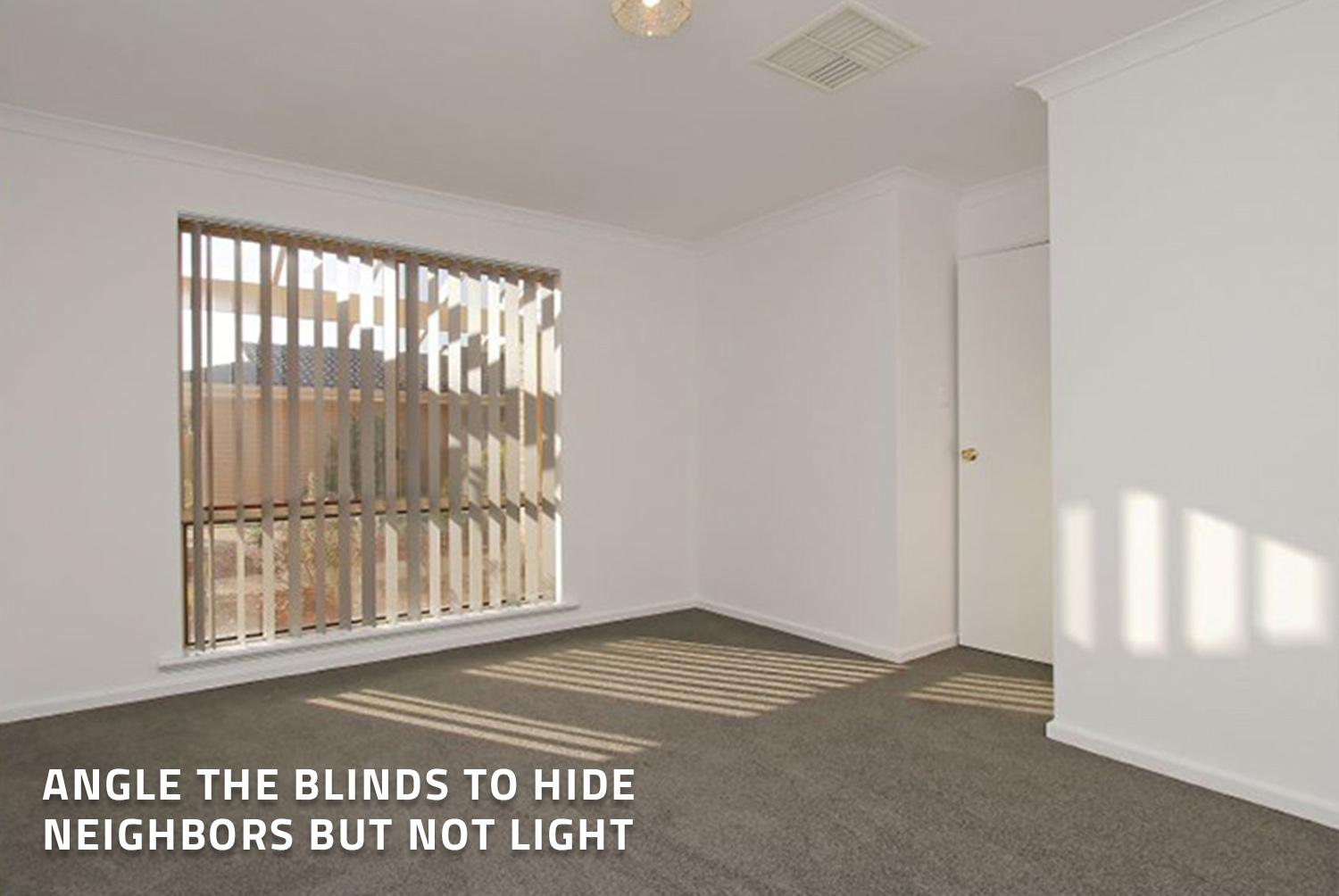
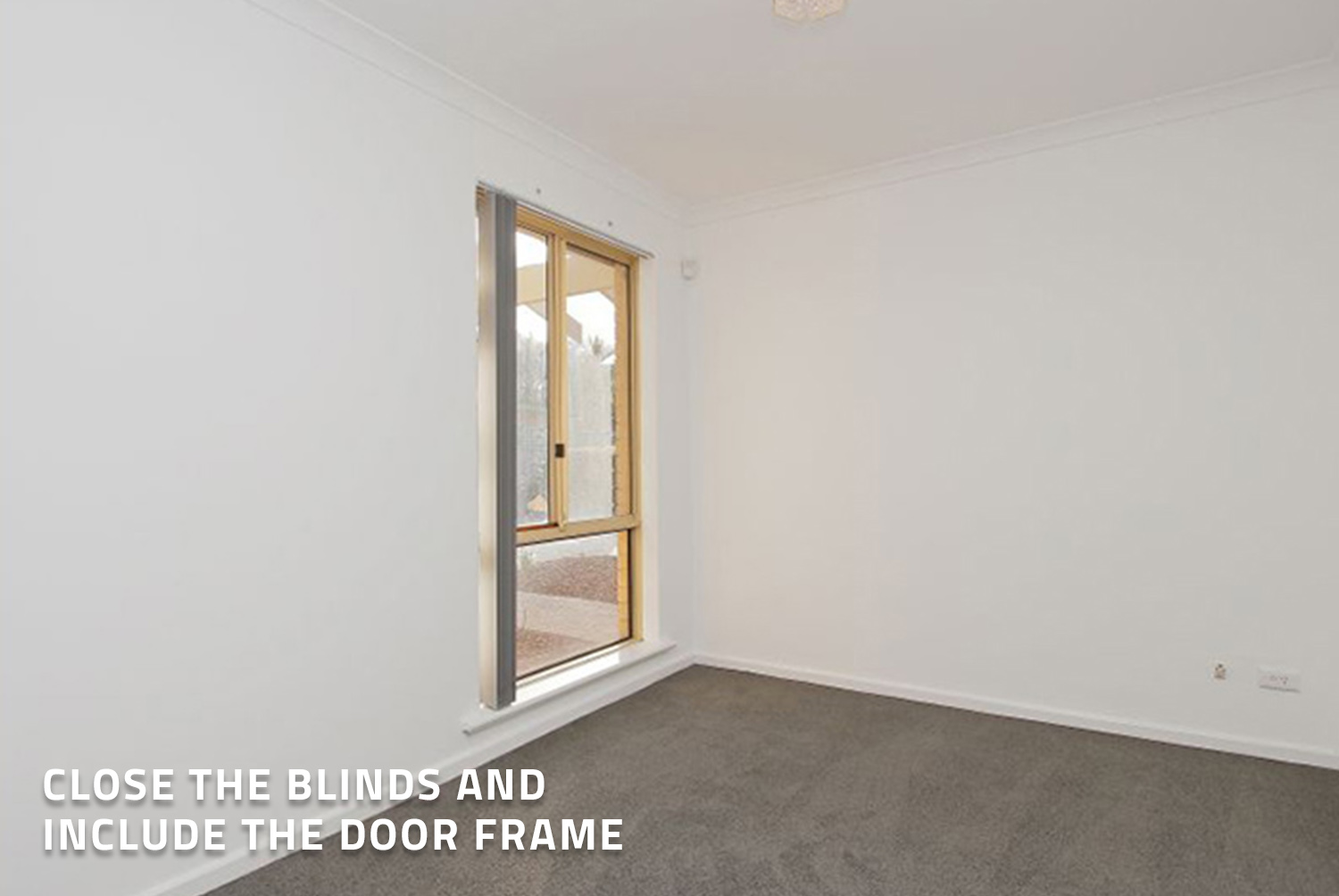
This room has clearly demonstrated that blind trick effectively. This is the perfect technique when hiding outside views without sacrificing light. Depending on which angle you are shooting the room from, you can then easily reangle the blinds to suit. The only suggestion that would have made this shot better is by opening that door opposite the bedroom. Other than that, this is a great shot.
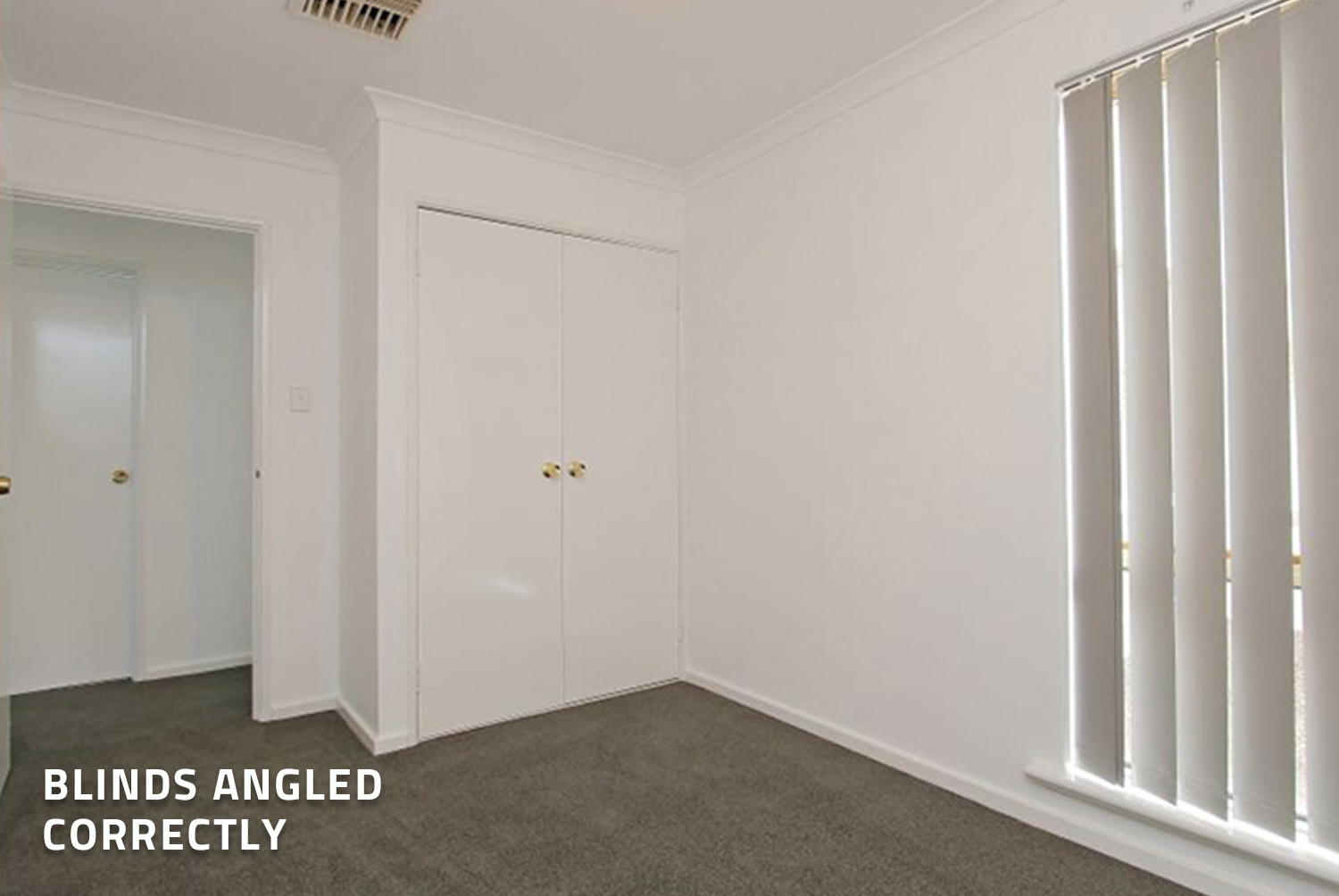
This is a perfect example of where the blinds have been done incorrectly. The shot could have been lovely simply adjusting the angle of the blinds. Remember to include part of the door in the image. By adding the door, it frames up images like bedrooms and bathrooms nicely.
This is another shot on a bathroom in the property. This one has been shot much nicer and is less cropped, however, it still could have been shot wider by standing half a foot to a foot backwards. This would have captured more of the shower in the frame, leaving you with a much more attractive image.
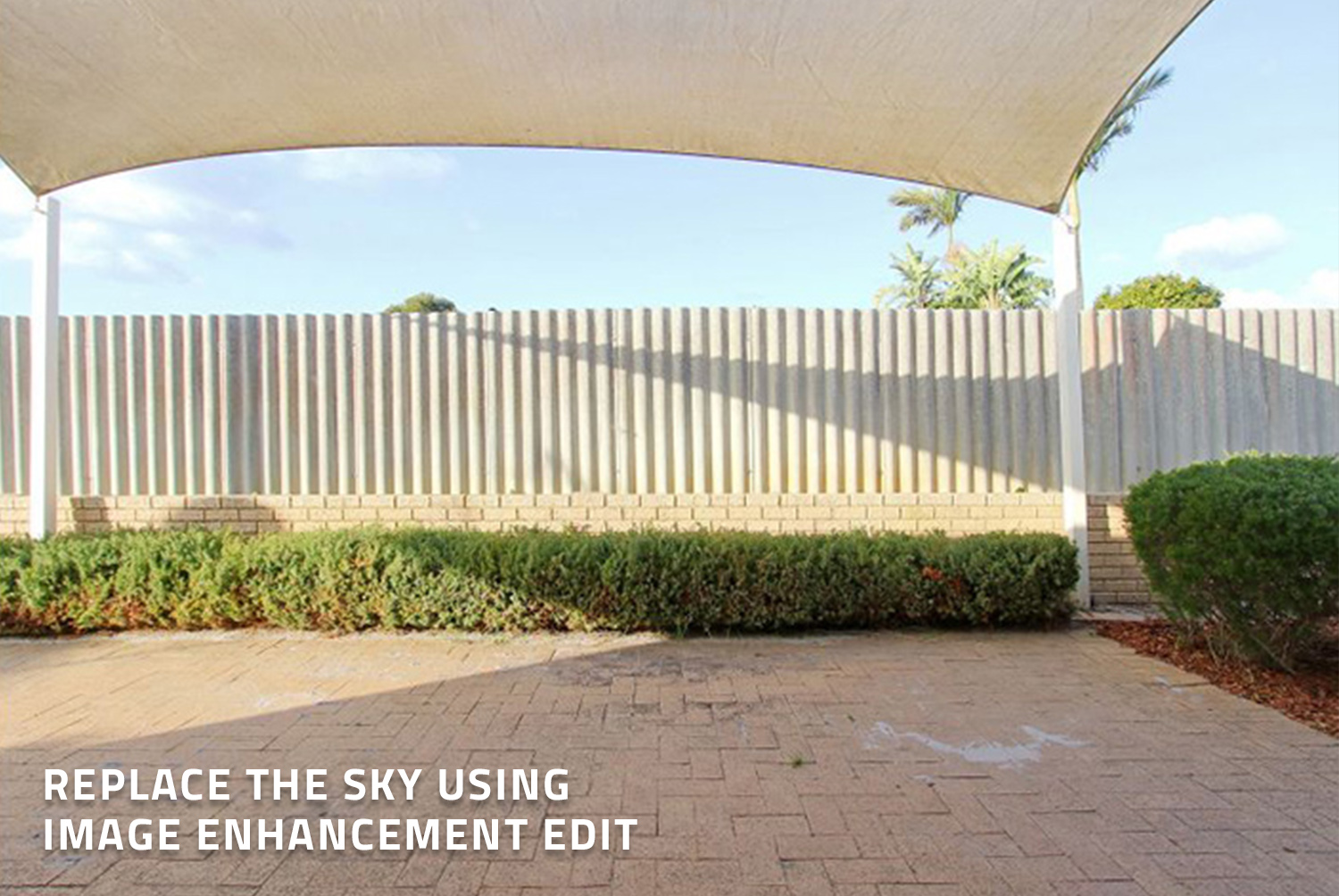
Moving to an outside image, if the debris on the pavement is cleanable, we could easily remove that using our item removal process. The straighten of the fence and the sky could be fixed through our image enhancement to make it look better than it currently is. The image is still passable however for a rental property.
This is another image of the outdoor area taken from a different angle. This is nearly a better image than the last one as the roof has been framed nicely. You do see a little of the neighbors, however, in this case that is okay. Being on this angle has made this more appealing to display what is attached to the property.
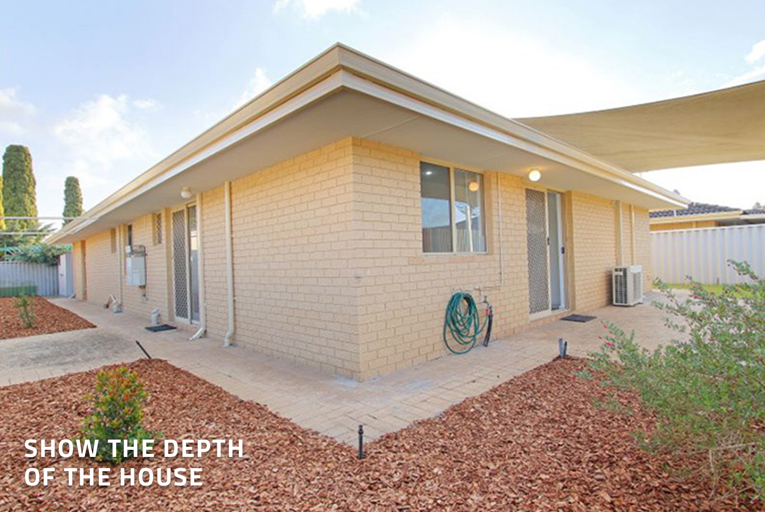
Again, another rear shot of the home. Whilst it is not a massive factor to have these mats still visible in a rental listing, if you wanted your property management marketing to be at its best, we would suggest removing these items. The garden hose can be stored up the side of the house when shooting the home to make the outdoor space look nice and clean. This is a great angle for showing the depth of the house and it includes both faces which is why it makes it such a good shot.
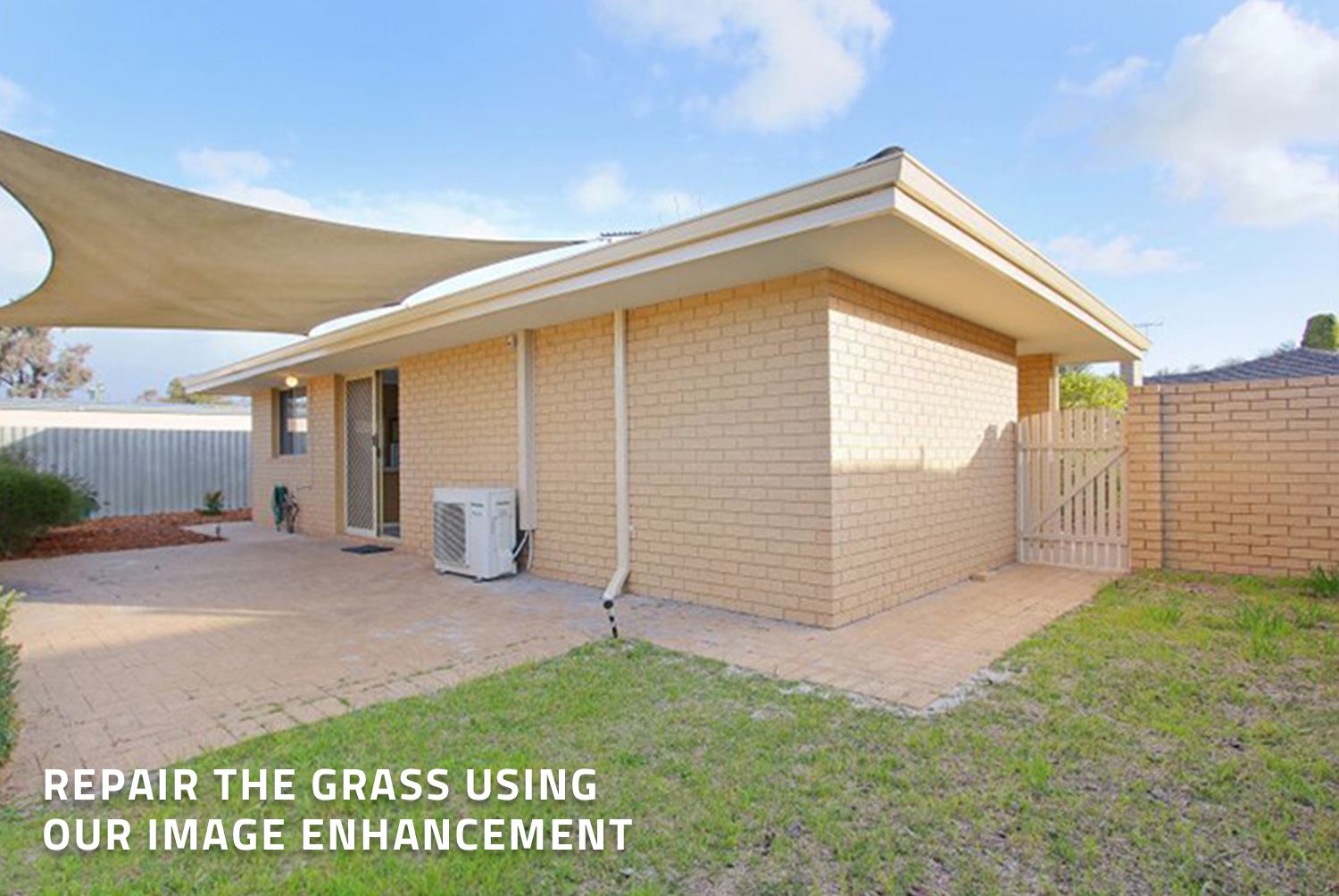
Once again, the depth is here which is quite nice, however, we would have removed the brick and used BoxBrownie.com image enhancement to repair the grass. The edit would also improve the sky which would compliment the image more. Again, we previously spoke about the removal of the hose and mats. The photographer however, has done a great job here by keeping the door open.
Conclusion
So there we have it. As mentioned throughout our blog, you can head to BoxBrownie.com and look at our Image Enhancement and Item Removal edits. You can use these products for any professional photos you take, as we are here to help your photos look their best.
If you have any questions about this blog, head to our contact page on the website to get in touch.
RELATED ARTICLES
In this post, our resident photography expert Brad Filliponi cuts through the geek speak to determine which 360° camera shoots the best Virtual Tour - the Ricoh Theta Z1 or the newly released Ricoh Theta X.
READ MORE
This interview with Charles Nitschke is a "must-listen" for builders, developers, and real estate professionals. Charles shares his cutting-edge techniques when pre-selling property including how he generated 6,600% more buyer inquiry on Zillow, how he effectively markets a product for a builder, and how he uses "clay drafts" to create interest to sell unbuilt property faster.
READ MORE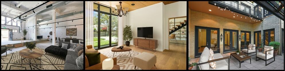
Transform your real estate listings and attract buyers with the ideal interior style. Discover how to effortlessly match your property to six stunning styles. Follow our expert tips to create an inviting, memorable space that stands out in the market.
READ MORE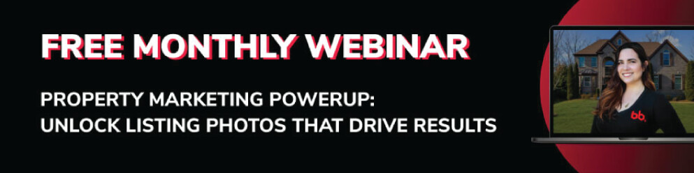
Join BoxBrownie.com’s free monthly Property Marketing Power-Up webinar — a 45-minute session packed with expert tips on creating stunning property listing photos using Image Enhancement, Virtual Staging, Floor Plan Redraws, and more to help you market properties faster and close deals!
READ MORE
If you want to start or keep the momentum going in your real estate career, these 10 proven lead generation techniques will keep things rolling even if the market slows down.
READ MORE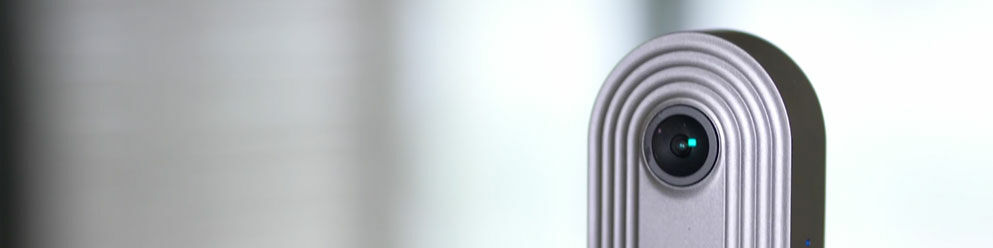
Join us behind the scenes, as we shoot a spectacular 360 Virtual Tour with a camera that costs a fraction of the price of other models on the market.
READ MORE